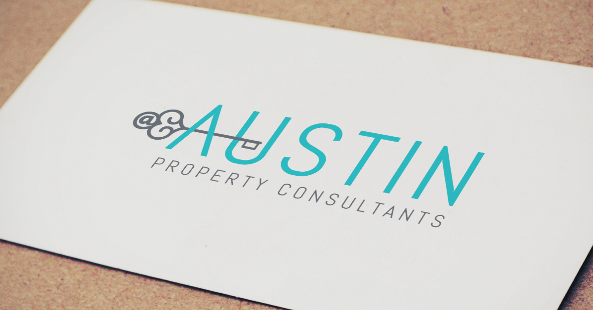
Tech savviness is a powerful thing in 2015, and it’s a quality that Christina Austin of Austin Property Consultants is quite proud of. Christina understands the power of social media and connecting with clients on all levels, and knew that was something that her new logo should hint at. She also wanted to make sure there were two ideas combined into the same logo, whether that was something regarding her area, or her tech savvy nature. The logo team knew that there must be a way to mesh a social aspect to the real estate business, and started hashing out ideas tying the two together.
Once the logo team got to work, some of the most interesting concepts came from combining the @ symbol with a key. After playing around with typography and different colors, we ended up going with a soft gray and aqua blue combo. Attentive members of the crowd will notice the subtle “at-sign” in the head of the key to the left. Using the length of the key to create the cross of the A, we tied everything all together.
After all was said and done, the logo team helped create a modern new look for a tech savvy agent. Being able to appeal to the millennial crowd in the Jacksonville area was one of the final goals we had to tackle, and after seeing the final product, we feel confident that Austin Property Consultants will do just that.