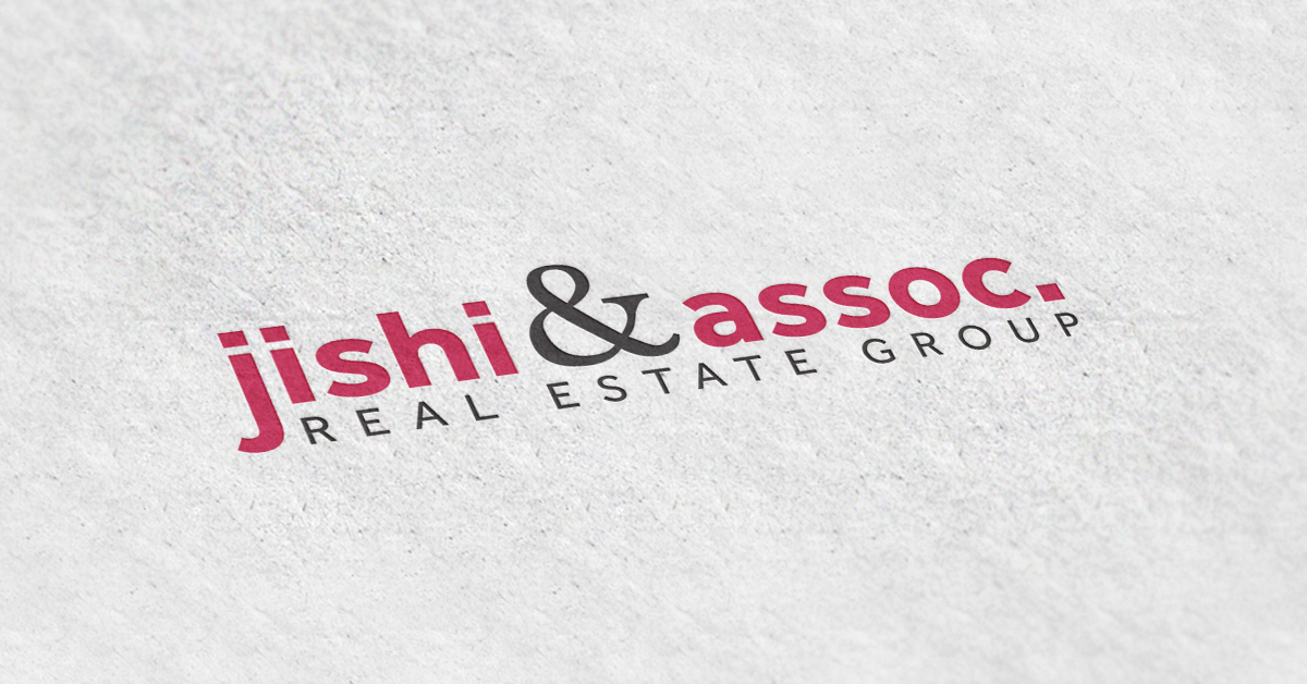
Hot off the presses, ladies and gentlemen, BrandCo is proud to present the new logo for Jishi & Associates. Chad Jishi was looking for something simple that could help him appear more professional and help him grow his real estate business. Having never really had a logo before, at least one that wasn’t created by himself or close friends, the logo team knew we had a special experience in our hands.
Starting the process with sketches, we explored a couple different styles including icon based designs and monograms. Originally we were going with “Chad Jishi Group” as the name for the company, and after working on that for a bit, Chad realized “Jishi & Assoc.” was the direction he wanted to go in. Eventually, we settled on a more typographic logo, using the elements and shapes of the letters to make something unique. We went with a more bold, modern style to the text, as we knew Chad had a somewhat younger audience. Using the serif style ampersand, we brought a touch of the traditional to contrast the modern so that it didn’t feel too clean cut or alienate a certain segment of the market.
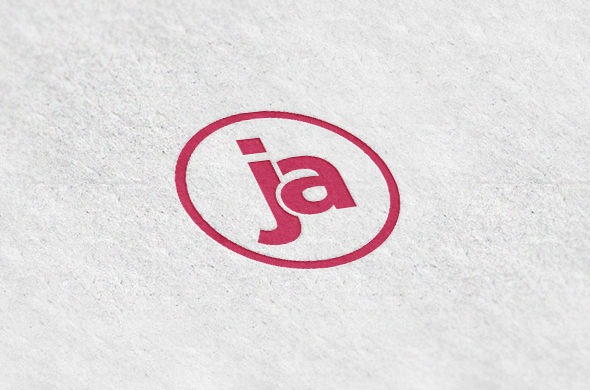
One of the final pieces we put together was a small icon that Chad could use in lieu of his new logo. Using the lowercase “j” and “a” from his name, we created a nice circular mark, and even added some depth by overlapping certain elements and curves of the shapes. We are firm believers in logos that are responsive and could adjust to whatever medium you are applying it to. Maybe there’s not enough space in the corner of your stationery for the entire text treatment logo. Having a small icon you could use instead will save space and ease up on the stress of forcing things to work. Icons also make a great watermark, and look perfect on social media platforms.