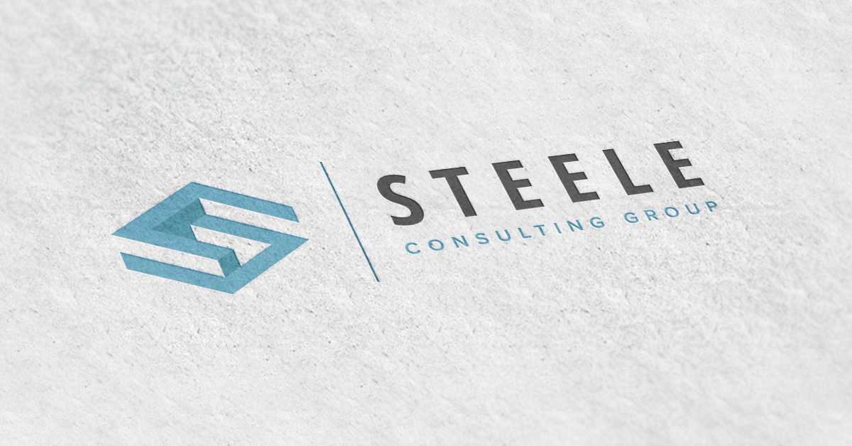
Steele Consulting Group is a company based out of the beautiful city of Chicago, where the majority of their work involves rebuilding neighborhoods and transforming properties into high quality homes. The real estate group came to BrandCo with a challenge: take their existing brand and push it into the future. Their previous logo combined towering sky scrapers and bold typography. The new logo had to portray the same strength and professionalism, while showcasing innovation and a strong design sense.
Needless to say, we accepted the challenge.
The team here at BrandCo built the new logo from the ground up around a strong central icon. We wanted something that could stand tall on it’s own. Taking inspiration from the Chicago skyline and the city’s homes, we were able to create an “S” icon out of interlocking shapes. The sharp lines and geometric style conjure up references to the architecture of the city, even playing off of the renovation side of their business. We then took it a step further and added depth to the mark with variations of color, evoking a 3D style that jumps off the page. We retained the bold style of their typography, as bold fonts tend to portray strength and power. The resulting logo captures the essence of Steele Consulting Group, a company that prides itself on its professionalism and drive for innovation.