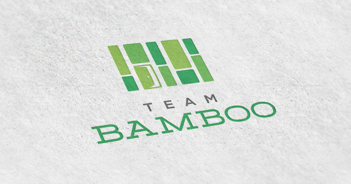
Angie Dunbar is the brains behind Team Bamboo, located in beautiful Kansas City. Angie wanted a new logo that had the same fresh and clean appearance as the brand she was looking to create. Their calling card is “A Fresh Alternative in KC Real Estate” after all, so we knew that was something we had to live up to.
The bamboo concept was something that our team focused on from the very beginning. Angie came to us with the idea, and knew it would be a perfect way to capture the essence of her business. Coming from a family that had been in the construction industry, she made the connection that bamboo is a very strong building material and could tie closely to her real estate business. Bamboo also brings with it a sense of freshness, a sense of serenity, and a certain contemporary style that we knew her logo would benefit from. Lastly, the bamboo plant is characterized by a dense root system, mimicking the community mentality of Angie and her team of agents. And let’s not forget how much panda bears love bamboo, and who doesn’t love panda bears?
After exploring a few different ideas, Team Bamboo and Team BrandCo settled on an interesting play between bamboo stalks and housing imagery. By adding the open door to the thicket of bamboo, we knew there would be no mistaking the relationship between the icon and real estate. Add in some soothing green tones, and you’ve got one fresh looking new logo.