The Beaches Properties needed a new look for their Jacksonville based real estate business. Carryn Iredale, the owner, was looking for a logo that captured a certain essence of the area. With clients ranging from snow birds, first time homebuyers, and even investors, Carryn wanted her logo to appeal to a wide range of people. With a name like The Beaches Properties, our creative gears began turning as soon as the consultation was underway, and our pencils had scribbled out a page FULL of ideas by the end of the call.
Our logo team talked about multiple ways to capture the idea of beachfront homes and the beach lifestyle. We also knew steering clear of obvious real estate imagery would help distinguish her brand from others. One of the ideas we came up with was a whale’s tail breaching the surface of the water. We immediately ran with that idea once Carryn gave us her blessing, but we made sure to explore other beach related imagery like waves, bubbles, palm trees, and the list goes on.
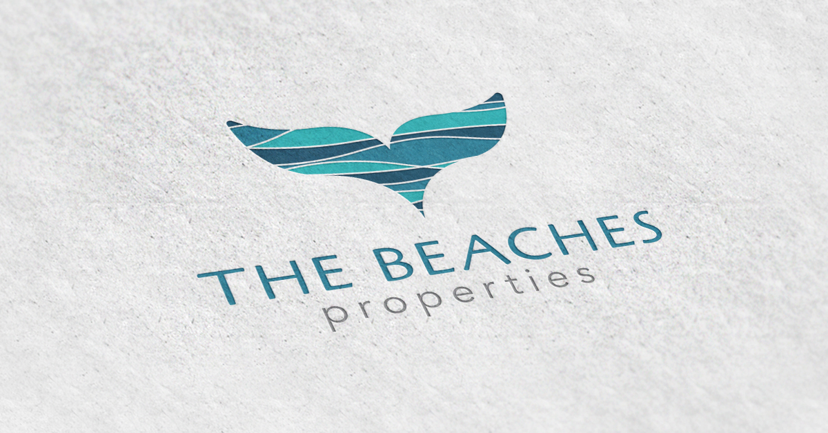
The Beaches Properties eventually became what you see here! We opted for a somewhat abstract representation of a whale’s tail for the icon. The pattern covering the icon was meant to symbolize the ebb and flow of the tides. We paired the imagery with a playful yet modern font, and used colors that mimic the clearest of blue waters. In the end, Carryn Iredale has a unique new look to her brand, and one that will help her stand out in the crowd.