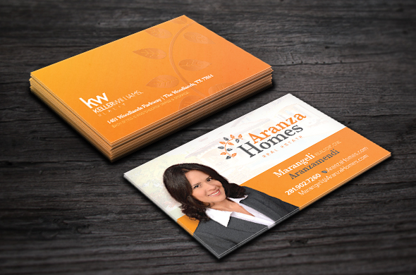
Marangeli’s fresh, new business cards are hot off the press and we absolutely love how they turned out! Stemming from her very organic and unique logo, we wanted to be sure that her business cards mirrored these same ideas. We were instantly head over heels for her color palette, so we decided to really let the orange shine with a complete wash on the back side of the card. We then utilized a duo-tone look on the front side to balance everything out in a visually appealing manner.
We designed this card to host all of Marangeli’s personal contact information on one side of the card while the rest of her Keller Williams® brokerage details would be placed on the back. Inspiration for the slightly off-center look of Marangeli’s personal contacts was drawn from her Aranza Homes typeface. We also gave her website address some flair with a leaf embellishment from her logo to draw attention to it. All luxury cards from BrandCo. have the option for glossy Spot UV elements. In this case we highlighted the leaf arch in her logo as a main element. We really love how these turned out!