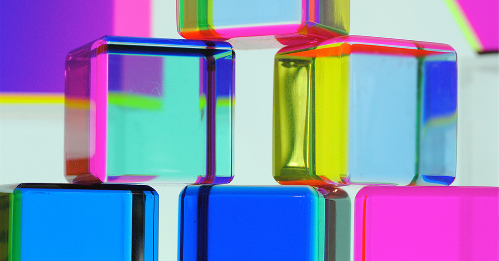
The use of colors in branding can have a profound impact on a client’s purchasing behavior. Some studies have show that people’s judgment about a product or service can be 60%-90% influenced by color alone. Colors can elicit different emotions and reactions, as well as a memorable impression. Whether you are painting your offices, designing your marketing materials, or creating a logo, here is what you need to know before choosing a color.
Blue
Blue is a widely used color in logo design. It stands for being dependable, trustworthy, and fiscally responsible. Big brands like Facebook, AT&T as well as Walmart, all use blue. This color is also used by most police stations, to build trust with the public. Several industries use this color hue including finance, lifestyle, and tech spaces. When used by brands, consumers generally feel safe and in responsible hands. It’s no surprise that tech companies like Facebook and Twitter have chosen blue as their brand color.
Yellow
Yellow is a very optimistic color. Since it is generally perceived as being bright, it has the ability to grab a consumer’s attention even from afar. That’s why McDonalds and Denny’s have used yellow in the design of their logos in a bid to attract hungry travelers. Yellow can also invoke feelings of happiness or excitement.
Orange
Orange is considered a friendly color. It is used by numerous brands including Nike, Nickelodeon, as well as Hermes. Bright bold orange is mainly used by stores to promote value such as Payless and Home Depot, which communicate affordability. According to branding experts, a subtle shade of orange represents an appeal to the upscale market.
Purple
If you want to portray your brand as imaginative, creative, or wise, then purple is the way to go. It can also be used as an emotional or soothing color. This is the reason why Hallmark used it when creating their primary logo, as well as branding their more than 40,000 stores worldwide.
Red
Red is used by some of the biggest brands in the world. Companies such as Coca Cola and Keller Williams use red as their primary color. It expresses passion and excitement. Red is usually used in combination with softer colors like yellow or white to add a sense of excitement. Tech companies like Netflix and YouTube, pair red with black to signal a modern-bold feel.
White
When white is used in marketing materials or logo design, it can convey a sense of transparency. White can also convey quiet and pure. Company’s such as Apple use white in their products to communicate a sense of simple and pure design.
Black
Black is often used in luxury marketing material and branding. That is why it is the preferred option for stretch limousines and glamorous evening wear. If you want to convey sophistication, drama, and a sense of status, then this is the color for the occasion. The primary brand color of Uber is black.
Everyone’s perception and preferences differ, making color selection more of an art than a science. Shades, hues and tints can also play into perceptions as well. So before finalizing your brand colors, make sure to do a bit of research and testing. The right colors can create a huge impact in the way potential clients perceive your brand.


