MLSAustin.info Launches into the Market

Check out the new www.MLSAustin.info property search website.  Using a map based IDX property search from Wolfnet Technologies the new MLSAustin.info provides property seekers an up to date list of the entire MLS and can receive daily updates of changes in the market, including price reductions, new listings and

The new real estate website is built on WordPress and features a custom theme and custom WordPress enhancements and plug ins for agents.

Arranging Pixels Aquires KansasCityWebDesigners.com

Website Designers in Kansas City, MO

On Friday August 26th Arranging Pixels completed the acquisition of KansasCityWebDesigners.com!  We are pleased to bring the the decades of branding and web design experience to Kansas City.  Visitors to KansasCityWebDesigners.com will be redirected to the Arranging Pixels Home page where they can learn about our services and culture.

Kansas City is the largest city in Missouri and is well known for its culture of music and food- including famous Kansas City BBQ.  The downtown area is lively and full of local businesses and is also home to many Fortune 500 companies.

We are proud to welcome the Kansas City, MO business owners to Arranging Pixels- We look forward to working with you!


The Proof is in the Analytics Pudding

If you’re like many business owners, your website has morphed over the years… it may not be as organized as it was in the past, or as up-to-date as you’d like.  But is your website doing what you want it to do?

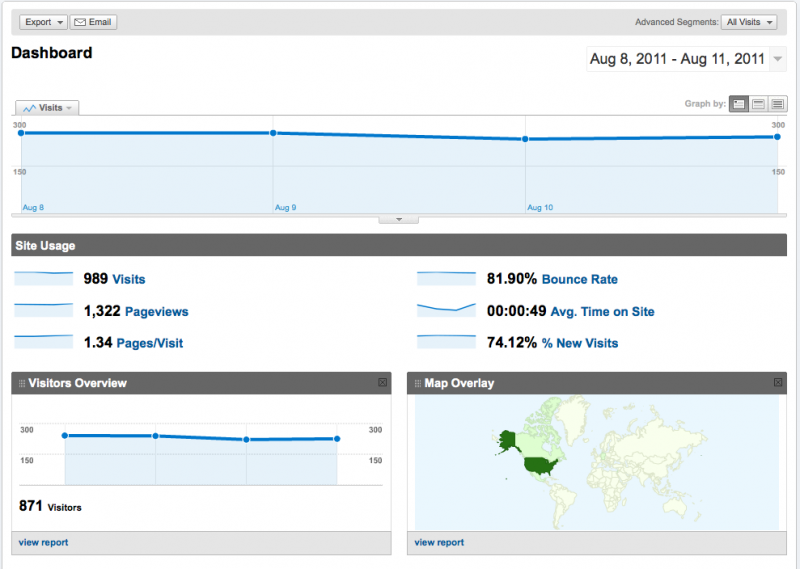
Take a look at this website we launched Friday.

This site has been around for more than a decade and has a large amount of traffic.  As we can see by the numbers above – 8 out of 10 visitors leave the website without clicking on a single link.  The average visit is under 1 minute and the average visitor visits 1.34 pages.

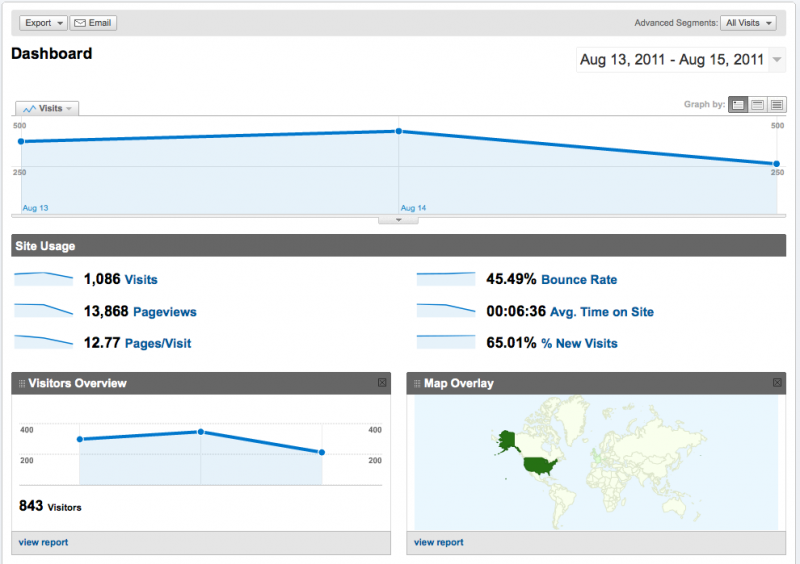
Here is the data for the first few days after launch.

The bounce rate is cut nearly in half- the time on site has increased by 700% and the pages per visit increased by nearly 10 times!!!

What would happen if you doubled the stickiness of your website?  Increased the number of pages your average visitor went to 10 times over, and kept your visitor on your website 7 times longer?  Wouldn’t that make an impact on your business?

Something to think about!

GREAT SCOTT! Great Website!

I think there’s something in the ice cold water in MN- We’re getting a lot of agents looking for awesome new WordPress Websites from the region and the new MNHomesForSale.com does not disappoint!

MN agent Tom Scott of ReMax Advantage Plus came to Arranging Pixels in search of a new real estate website and boy did he get one- with a super-cool property search from Wolfnet Technologies.

If you’re thinking about buying a new home- or even a second home in MN give Tom a shout!!

NOVA isn’t just for Science Geeks- Think Real Estate!

Northern Virginia Real Estate Website Sure the DC area is a great place to visit- but we’ve learned its an awesome place to live!  The Long and Foster office in Fairfax VA has been making their mark and taking the Northern VA real estate market to a whole new level!  Real estate agent Athena Peterson understands the value of a strong internet presence and has worked hard to provide her clients with an amazing resource on the new HomesOfNorthernVA.com.

Thanks to a robust property search from Wolfnet Technologies call MapTracksSM Athena provides her buyers and sellers a single site for all their real estate needs.  So if you’re thinking of a home in NOVA- you’ve got to check this out!

Two Great Communities – One Great Agent

Daytona Beach Keller Williams Agent Ron Wysocarski is taking his “farming” to the cloud with several new neighborhood specific websites for Town Park and Waters Edge.  Look for more community based websites coming to agents near you!  If you’re not building sites to service the communities you service – you should think twice before someone starts to market to your niche.

Who Doesn’t Love Salt Lake?

Okay, so I’ve never been there- but my next ski trip is going to be to Salt Lake City, UT – where I’m definitely going to visit Kelly Favero a local Keller Williams agent and real estate expert!

We first met Kelly at KW Family Reunion in Anaheim and since then we’ve been working on this totally awesome new real estate website.  We’ve integrated Wolfnet Technologies MapTracks property search and the site looks AMAZING!  If you’re looking for a primary home or maybe just a vacation home – you’ve gotta check out Kelly and LoveSaltLake.com!

What can a guy to do to get a little action around here?

If you’re like many website owners- you’re frustrated with the amount of action you get.  Whether you want to capture leads, sell a product, or just get people to like you- chances are you want to get something out of that fancy website you’ve worked so hard for.  But how do you get your website visitors to do what you want them to do?

The trick here is to engage your users-  Tell them what you want them to do- You must create a successful Call to Action.

Before you create your call to action you need to decide what it is you want your website visitor to do.  You might want a user to complete a contact form, signup for a newsletter, download information, purchase something online or more.  Write it down- right now-  What is the one specific thing you want your visitor to do when they get to your website?

Now that you know what you’re trying to get out of your visitors its time to create your call to action.  A good call to action uses effective imagery to grab your visitors attention. There should be a balance of “white space” so that your call to action stands out from the rest of your site and its design. For instance, if you are a real estate agent who wishes to have users of your site search for property in the area you serve, then a large property search button positioned in a prominent place on your site is a great call to action.

Having an effective call to action will actually help your users users and give purpose to your website. It can also be seen as a way to measure your sites success. For instance using a prominent call to action which leads to an increase in the number of product purchases or newsletter sign ups shows that your site is doing an effective job in promoting you and your brand. Always make sure to tell users what you want them to do, guide them through what process you want them to follow.  Don’t be afraid- you’re actually helping your visitors by getting them to the most important part of your website.

So, in short, here are 3 ways to make a successful Call To Action:

  1. Use Large Imagery: Large prominently placed imagery drawing attention to the call to action is always a great idea.
  2. Create a need: this is marketing 101, before you even think about where you place your call to action you need to make sure that you create a need for the user to interact. On top of this, make sure you highlight the benefits of responding, searching, signing up etc. Use active/urgent language such as “Buy” “Sign Up” “Register” “Search Now” “Donate” etc. All of these are words and phrases which require the user to do something.
  3. Have a Call To Action on every page: This is important as users generally go deeper into your site than just the homepage and if you were encouraging them to sign up to your newsletter on the home page but no where else then you are definitely losing out!

In addition to this, make sure you follow through on what your call to action is. If you are signing people up to a newsletter then make sure they are on the list, if you are encouraging them to contact you for more information, make sure that you respond to them in a timely manner and get them this information.

Finally, keep it simple! The keys successful call to action items is keeping it simple. People have short attention spans, if your website is too complicated your visitors are likely to give up.

GoSecondHomes Gets a Second Chance

When Avalar agents Michael Brown and Michael DaSilva came to Arranging Pixels to breathe some life into their website we knew exactly what it would take.  Michael and Michael were using an off the shelf WordPress theme that did not allow them the navigation structure to make their website easy to navigate.  So we stripped the theme down to its underwear, and gave it a whole new look- including easy to use navigation, great call to action graphics and a new header.

Here is what gosecondhomes.com looked like before our refresh: