Custom designs regularly come out of our astounding team here at BrandCo. We love taking the time to spotlight some of our favorites and share them with all of you. The Keller Williams eAgentC platform is non-responsive and our developers and designers come together to take them mobile-friendly and full-width. Check out the fresh new sites that these KW agents have the pleasure of sporting!

Start Your Move
If you’re wanting to work with a real estate powerhouse, Cindy Hamann would be the Realtor for you. Cindy is located in The Woodlands of Texas and she has made the focus of her Keller Williams website creating an amazing team of agents. The minimal feel that Piero has designed for this website makes it easy to focus on what is important, like the calls to action of Our Story, Marketing & Technology, Culture, and Education. This is a great example of how to use your eAgentC website outside of gaining leads for selling/buying homes.

Clift Barnewolt
Scottsdale Arizona local Clift came to BrandCo needing a fresh look for his web presence and Denika was happy to provide it. I am especially fond of the night shot of this beautifully light Arizona home that you are greeted with once you enter the website. It’s obvious that golf course homes are a specialty of Clift’s and it has been highlighted on the homepage with a call to action above the website fold. He’s getting to show off that Keller Williams red throughout, as well.

Team Generations
Minimal and modern is a great way to describe the new website that Trevor has designed for Karen and her team in Jacksonville Florida. Something that I adore about this website is the varying sizes in which the buttons are displayed. You can easily tell that a big focus for this team is beach properties and gaining listings. Aside from those two buttons, they also have links to golf properties and vacant land. With Team Generations, it’s their team, your dream!

Hausherr Homes
When we think bright, we think of the Hausherr Homes website. Tony, our beloved designer, helped Mark discover his new brand. Based out of Tampa, this agent makes it a mission to list and sell pool, equestrian, golf, and water view properties. Trust, integrity, and service are characteristics that Mark lives by and brings to his business. Be sure to check out his sunny and cheerful website today!


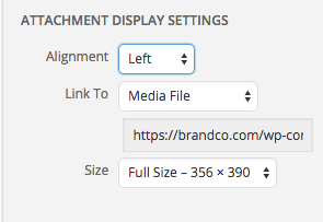
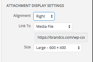

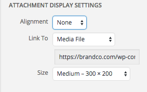
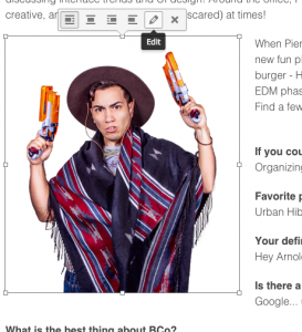 Take time to play around with your image options in your WordPress install. You can easily add images to your Pages and Posts by selecting Add Media. You can also edit any images that you have already inserted by clicking them within your Editor and selecting the little pen tool that shows up.


 In different to Posts, Pages, compared to the contents of a book store, are more like your novels. They carry the information that should never grow old and won’t carry a date for when it was published. Pages are great for housing text that discusses your team or how to contact your business. They often are used for carrying the main site purposes, too. Looking to sell homes in a specific community? It would be smart to include this information on a Page, linked up in the Menu…or displayed on your homepage. To add to this, you should also expect to blog about happenings, available homes, and properties that you’ve sold within this community of focus from inside of the Posts area.