Logo Spotlight – Gini Ingram

Gini Ingram’s new logo is fresh out of the BrandCo oven! Our team just put the final garnish atop the logotype for the Lafayette, Louisiana based Realtor®. Gini is a newer agent, and as such, needed help establishing her brand. During our initial consultation, we talked about really trying to capture the essence of the area she lives and works in. We discussed traditional Cajun imagery like the Acadian style housing that was very popular in the area, as well as the symbolic fleur de lis. The most important thing was that the logo feel warm, inviting, and make people feel comfortable. Gini Ingram’s brand is all about southern hospitality, and having her clients feel right at home with her.

Gini Ingram, Realtor® Logo

We knew that Gini would be interested in seeing script options for her name. So, we broke out our fancy watercolor pens and some crisp, white paper and wrote her name over and over and over again. Once we had a few options to our liking, we scanned the options into the computer and began fleshing the typography out. Once the script was just right, we added the traditional fleur de lis as a dot on one of the i’s.

Using the word Realtor® in a logo can be tricky, so we worked within the National Association of Realtors guidelines to make sure that Gini’s new look was in compliance with their rules and regulations. Through our investigations we created a look that both satisfied the NAR, as well as brought that warmth and personality that Gini wanted all along.

Why You Shouldn’t Use Someone Else’s Content

As we’ve preached for years and years, content is the key to achieving Search Engine Optimization! Simply put, Search Engines want to know what you have to say and they want to be sure it’s said with your readers in mind. With content being so important, blog writers and/or website users are often tempted to simply take it from others. Here are the top reasons why you should create your own content instead of copy it.

Don’t Waste Your Time

Believe it or not, if you found content on the internet, it is most likely already indexed on the majority of Search Engines. But what does that really mean? It means that sites like Google, Yahoo, Bing, etc are already giving credit to a specific domain for the content you found. If you copy and paste that content into your website, you’re then considered a duplicate. Search Engines do not want to credit duplicated content as a dependable source when answering users’ questions. They’re10x more likely to provide the original content than to ever suggest yours to someone that is searching for the information. If the purpose of adding content to your site is to be found in Search Engines (the fabled SEO), then copying and pasting someone else’s work is a step backwards and you’re mostly just wasting your time.

Your Readers Want to Hear From You

People end up on your website because they want to know what you have to say. In the instance of real estate agents, your current and potential clients want the opportunity to get to know you through what you write. It seems strange to think that your personality comes out in what you type, but it definitely does. If they wanted to read that other content, they would have found it on their own. Yet, they came to your website! Give them the real deal! If you had access to that other content, they most likely did, too. Sell yourself, not someone else.

You’re the Expert

When you’re writing for your website, you’re giving your real-world knowledge the ability to come to life on the internet. You know what you’re talking about. Don’t feel the need to take content just because it is online. The content that your readers want is the information that you tell your clients, friends, family every day. Having that info available online, at-the-ready, for all your potential friends and future customers, is what will help increase your web presence.

Most Importantly, It’s Plagiarism

Whoa! That’s a serious word! But, it’s true! Plagiarism is defined as “the practice of taking someone else’s work or ideas and passing them off as one’s own.” I know that Plagiarism seemed like a more punishable offense prior to the world wide web, but the impact on SEO makes a big difference in the success of your website.

If you find articles on the internet that you feel would have a great place within your website, there are options. It’s best to use that information as inspiration rather than taking it word for word. Credit your source. Write in your own words. Be original. Your readers will appreciate it and you’ll get the bump in ranking that you’re looking for.

Print Spotlight – Marangeli Aranzamendi

Marangeli’s fresh, new business cards are hot off the press and we absolutely love how they turned out! Stemming from her very organic and unique logo, we wanted to be sure that her business cards mirrored these same ideas. We were instantly head over heels for her color palette, so we decided to really let the orange shine with a complete wash on the back side of the card. We then utilized a duo-tone look on the front side to balance everything out in a visually appealing manner.

We designed this card to host all of Marangeli’s personal contact information on one side of the card while the rest of her Keller Williams® brokerage details would be placed on the back.  Inspiration for the slightly off-center look of Marangeli’s personal contacts was drawn from her Aranza Homes typeface. We also gave her website address some flair with a leaf embellishment from her logo to draw attention to it. All luxury cards from BrandCo. have the option for glossy Spot UV elements. In this case we highlighted the leaf arch in her logo as a main element. We really love how these turned out!

Interior_PS0928

Logo Spotlight – The Beaches Properties

The Beaches Properties needed a new look for their Jacksonville based real estate business. Carryn Iredale, the owner, was looking for a logo that captured a certain essence of the area. With clients ranging from snow birds, first time homebuyers, and even investors, Carryn wanted her logo to appeal to a wide range of people. With a name like The Beaches Properties, our creative gears began turning as soon as the consultation was underway, and our pencils had scribbled out a page FULL of ideas by the end of the call. 

Our logo team talked about multiple ways to capture the idea of beachfront homes and the beach lifestyle. We also knew steering clear of obvious real estate imagery would help distinguish her brand from others. One of the ideas we came up with was a whale’s tail breaching the surface of the water. We immediately ran with that idea once Carryn gave us her blessing, but we made sure to explore other beach related imagery like waves, bubbles, palm trees, and the list goes on.

The Beaches Properties eventually became what you see here! We opted for a somewhat abstract representation of a whale’s tail for the icon. The pattern covering the icon was meant to symbolize the ebb and flow of the tides. We paired the imagery with a playful yet modern font, and used colors that mimic the clearest of blue waters. In the end, Carryn Iredale has a unique new look to her brand, and one that will help her stand out in the crowd. 

Getting Fresh with Responsive Websites for Keller Williams

Custom designs regularly come out of our astounding team here at BrandCo. We love taking the time to spotlight some of our favorites and share them with all of you. The Keller Williams eAgentC platform is non-responsive and our developers and designers come together to take them mobile-friendly and full-width. Check out the fresh new sites that these KW agents have the pleasure of sporting!
CindyHamann_BlogExample responsive refresh

Start Your Move

If you’re wanting to work with a real estate powerhouse, Cindy Hamann would be the Realtor for you. Cindy is located in The Woodlands of Texas and she has made the focus of her Keller Williams website creating an amazing team of agents. The minimal feel that Piero has designed for this website makes it easy to focus on what is important, like the calls to action of Our Story, Marketing & Technology, Culture, and Education. This is a great example of how to use your eAgentC website outside of gaining leads for selling/buying homes.

CliftBarnewolt_BlogExample responsive refresh

Clift Barnewolt

Scottsdale Arizona local Clift came to BrandCo needing a fresh look for his web presence and Denika was happy to provide it. I am especially fond of the night shot of this beautifully light Arizona home that you are greeted with once you enter the website. It’s obvious that golf course homes are a specialty of Clift’s and it has been highlighted on the homepage with a call to action above the website fold. He’s getting to show off that Keller Williams red throughout, as well.

KarenGartley_BlogExample responsive refresh

Team Generations

Minimal and modern is a great way to describe the new website that Trevor has designed for Karen and her team in Jacksonville Florida. Something that I adore about this website is the varying sizes in which the buttons are displayed. You can easily tell that a big focus for this team is beach properties and  gaining listings. Aside from those two buttons, they also have links to golf properties and vacant land. With Team Generations, it’s their team, your dream!

MarkHausherr_BlogExample responsive refresh

Hausherr Homes

When we think bright, we think of the Hausherr Homes website. Tony, our beloved designer, helped Mark discover his new brand. Based out of Tampa, this agent makes it a mission to list and sell pool, equestrian, golf, and water view properties. Trust, integrity, and service are characteristics that Mark lives by and brings to his business. Be sure to check out his sunny and cheerful website today!

Logo Spotlight – Team Bamboo

Angie Dunbar is the brains behind Team Bamboo, located in beautiful Kansas City. Angie wanted a new logo that had the same fresh and clean appearance as the brand she was looking to create. Their calling card is “A Fresh Alternative in KC Real Estate” after all, so we knew that was something we had to live up to.

Team Bamboo Logo

The bamboo concept was something that our team focused on from the very beginning. Angie came to us with the idea, and knew it would be a perfect way to capture the essence of her business. Coming from a family that had been in the construction industry, she made the connection that bamboo is a very strong building material and could tie closely to her real estate business. Bamboo also brings with it a sense of freshness, a sense of serenity, and a certain contemporary style that we knew her logo would benefit from. Lastly, the bamboo plant is characterized by a dense root system, mimicking the community mentality of Angie and her team of agents. And let’s not forget how much panda bears love bamboo, and who doesn’t love panda bears?

After exploring a few different ideas, Team Bamboo and Team BrandCo settled on an interesting play between bamboo stalks and housing imagery. By adding the open door to the thicket of bamboo, we knew there would be no mistaking the relationship between the icon and real estate. Add in some soothing green tones, and you’ve got one fresh looking new logo.

Element Beauty Spa Website

Element Beauty Bar and Med Spa came to BrandCo looking for a new custom website that would have a natural feel with a touch of luxury. Designer and resident BrandCo diva, Bianca, was more than happy to work on a project that involved beauty.

Screen Shot 2015-09-15 at 5.34.51 PM

Element’s new location in Longwood Florida, had just been remodeled with new colors and decor and was the perfect influence that the new website needed. Their walls had just taken new splashes of paints colored in Pebble Grey, Icy Teal, and Ocean Abyss…colors that are reflected through out their design. the colors express a look and feel of luxurious calmness with a very modern overtone.

Screen Shot 2015-09-15 at 5.32.45 PM

A big focus on Element Beauty Spa’s custom website was to display their vast amount of services and to allow people to book appointments. You can find the list of options for their Beaty Bar, including Makeup application, Salon services, Blowtique, and Nails. Their Med Spa include great services such as spa and facial treatments. All areas of the site are incredibly informative with photos or descriptions that explain or describe the services offered.

This modern website is one that we’re very proud of. We are so pleased that Element Beauty Spa trusted us with their brand and that we were able to make their dream website come to life in a dramatic and mobile-friendly fashion.


How to Align Images in WordPress

Formatting your images can make all of the difference when it comes to framing up and assisting your content in WordPress posts and Pages. Lucky for you, WordPress has given you everything you need to manage your images and to make your content look awesome! In this blog post, we’ll go over how to format your images by using alignment controls within the Insert Image area. We’ll also discuss the use of Photo Galleries!

Format Your Images with Alignments

Left Alignment

Screen Shot 2015-09-15 at 5.13.11 PMUsing alignment to the left allows you to have your content wrapped around your images. When your image sits to the left, your content will wrap along the right side of it. When you are adding in an image that you want to have left or right aligned, you will need to have your cursor at the area where you want the image to break and to be aligned by. Such as, with this image to the left, I inserted the image before beginning this paragraph (before the “Using”).

Right Alignment

Screen Shot 2015-09-15 at 5.16.03 PMIn opposition to Left alignment, the Right alignment option gives you the exactly opposite effect when inserted. All of your content that is entered “after” the image will wrap to the left side of the image. This is a nice way to frame up things that you are talking about in your posts or pages. I prefer to alternate between left and right alignment when adding images to pair with what I discuss in my posts.

Center Alignment

Screen Shot 2015-09-15 at 5.16.13 PM

Unlike Right and Left alignments, Center aligning your images will cause a break in your content. I use center alignment regularly when using larger images so that content doesn’t get squeezed to one side of the other of the image. As you can see, demonstrated here, that this option puts the image in the middle of the content and separates content to above and below it.

Alignment None

Screen Shot 2015-09-15 at 5.16.21 PMThis option can sometimes be a wild card depending on the code of your WordPress theme. As you can see, on our website, the None alignment lays the image in line with the content. It works much like Left Alignment for us, but it doesn’t allow for the content to wrap to the right hand side of the image.


Screen Shot 2015-09-15 at 5.26.16 PM
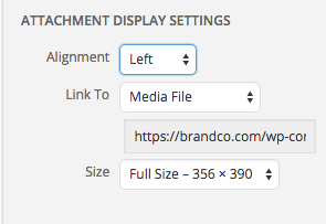
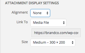
Take time to play around with your image options in your WordPress install. You can easily add images to your Pages and Posts by selecting Add Media. You can also edit any images that you have already inserted by clicking them within your Editor and selecting the little pen tool that shows up.
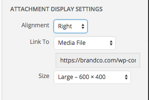
Managing how your photos are aligned with your content and make all the difference to your readers.


Logo Spotlight – Concept One Real Estate

Concept One Real Estate, based out of Portland Oregon, isn’t your average real estate firm. Josh Friberg founded his business on the belief that your home is the first thing that determines major aspects of your life. Everything from your local hangouts, what you do for fun, even where you work is determined by where you live and what your surroundings are. Concept One as a brand expands into many other branches outside of the real estate world, including business development and podcasting. Josh is also one of 30 nationally certified trainers/teachers of The ONE Thing, and you can find him giving speaking events in the Portland area and across the country. 

JoshFriberg_Interior_9-11-2015

Concept One was always meant to be a typographic logo – basically a logo that uses text as the main element instead of an icon. Representing a brand or an idea using only text can be a difficult task, but not an impossible one. So, with the knowledge that Concept One is rooted in technology and training, we knew the logo had to be clean and classy. It also had to be flexible, so that the client could adapt the logo for the other branches of the business.

We used good old fashioned pencil and paper to flesh out a way of transforming the negative space in the letter C into a 1. The use of negative space is an integral player in logo design and can lead to innovative and memorable icons if used properly. Pairing that idea with a clean, modern font gave us the perfect look for this fresh new brand.

Clients Get Fresh with Responsive Refreshes to eAgentC

Every week our team launches some really astounding responsive designs for the Keller Williams eAgentC platform. We make it possible to take a non-responsive area and allow for it to be custom designed to fit their business and their clients’ needs by allowing them to work on all mobile platforms. Take a look at these awesome new works we have to show you!

AnneLawrence_BlogExample Anne’s Distinctive Homes

Anne Lawrence come to us for a new mobile design for her website. Graphic designer, Bianca, and web developer, Eric were happy to help bring her new minimal design to life. When entering the website, you’re instantly greeted with a warm beautiful home and the ability to quickly search for homes. Three calls to action are included near the fold for users to get both buyers and sellers resources and the ability to grab your home’s value. You can also connect with Anne through social media or to view her testimonials. The use of red and white makes the design really pop as well as keep the over all design very clean.

CarolynBurleson-Webb_BlogExample

Call FL Home

Orlando Florida is home to Keller Williams agent Carolyn Burleson-Webb. Designer Piero took the opportunity to make this Florida-native client a beach themed website to match her business needs. Carolyn’s website meets users with a welcoming scene of palm trees and the beautiful Florida sun. This is an excellent visit for those interested in relocating to Orlando and want to know more about what the city and its surround areas have to offer. You can connect with her on Facebook as well as check out what her clients have to say in her Testimonials. Within this website’s blog area, you can learn about DIY projects that will help to sell your home. I am sure that more great information will be on the way from them, as well.

DanetteEarnest_BlogExample

Phoenix Real Estate Group

This desert centric design from Piero was exactly what the Earnest Real Estate Group was looking for. Located out in Phoenix Arizona, a landscape of beautiful stone work homes, cactuses, and desert sand is something very welcomed. Earthy tones are used through out to represent the area appropriately. On this website, the home search area is displayed vertically and along side a gorgeous home. Users can find six key calls to action, guiding them to area such as Global Property Searches or Careers in Real Estate.

GeorgeRenfro_BlogExampleLuxury Homes in Houston Texas

George Renfro, agent of Keller Williams, focuses his business on Luxury home sales in Houston Texas. His new website design is a combination of both minimalism and luxury. The home you are met with as you visit the website is grand in scale, demonstrating the kinds of homes that he would like to work with. With 40 years in the business, George’s website is set to help him go the rest of the way for his clients. You can find the ability to connect with him through both Facebook and LinkedIn. Also, you can read a few raving reviews from his clients.