eAgentC Sites Responsive with BrandCo Refreshes

It’s that time again. We’ve been busy, but then again…when are we not? Our team of designers, developers, and launch specialist have been delivering some amazing work to our clients. Check out what’s new!


Wil Richard responsive refresh Wil Richards

Trevor’s design for Colorado based Wil Richards is mimimal with a black and white base and splashes of red. I’m especially fond of the vectorized red mountains behind the city scape. It’s a very bold design that is sure to wow Wil’s clients.
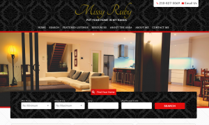
 

Heidi Sanches responsive refreshHeidi Sanchez

Tony had the pleasure of working on this beach themed website for Heidi. She serves the West Palm Beach area, where special pieces of her site cater. Not every website we build includes a dog-friendly section for Heidi to fill in within her Piggyback Blog.
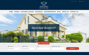
Adam Fernandez responsive refreshAdam Fernandez

Adam owes his awesome refresh to a collaboration with designer, Piero. This city focused design is on point at promoting Adam and his business. A fabulous thing to notice on this design is the addition of the Google Translater at the top, this allows every page of Adam’s website to be translated to any language that his client needs.

Cathy Binkerd responsive refreshCathy Binkerd

Cathy’s new responsive refresh takes a different direction that others that we have done. Tony makes the site feel wild with nature and he utilized rustic undertones throughout. The large photo of the woman with out-stretched arms makes you really want to Experience Utah! Not to mention, Eric worked out some really awesome hover effects on the homepage buttons during development!

Howard Serena responsive refreshHoward Serena

Another minimal design is brought to life for Howard with focus on all the great things to do and see in Bradenton, Florida. You can check out within the Menu that we have specific golf courses, neighborhoods, and beaches are easily accessible for his clients.

Holly Couture responsive refreshHolly Couture

Holly’s website opens with a view of a beautiful conservative living room scene. The use of colors by Piero really make this design pop to users upon arriving to the website. The group’s tagline ” a future with style” is definitely alive and well in the design and color usage.

Doug Curtis responsive refreshDoug Curtis

San Antonio is definitely the focus of Doug’s new responsive refresh by Piero. This city-centric design encourages clients to set up time to grab coffee with team members Doug and Michelle. They are also utilizing their Piggyback Blog, making their site more and more accessible to people s

Deb Haussmann responsive refreshDeb Haussmann

Denika provided a very conservative design for Deb that focuses on the area of Eastern Iowa. Buyers are easily able to search for homes within specific cities that this Dream Team serves by just a single click. This website also houses a page where they are adding helpful videos for their clients.
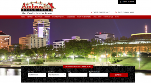
Mark Grifo responsive refreshMark Grifo

Mark’s website, also designed by Denika, has a traditional style that focuses on potential empty-nesters. This focus group is often Downsizing or Relocating and Mark wants to be the guy to serve them.


This week was full of beautiful minimal and conservative designs, also those that focus on the cities that the Realtors serve. All of these websites are custom to the needs of our clients and what will fit their needs of their business, whether they perfect to buy or to sell or if they focus on a specific niche. There are so many ways that a responsive refresh can turn and it’s exciting to see each new one that we roll out to our clients.

Another Week Full of Fantastic Responsive Refreshes!

Another week is down here at BrandCo and another amazing batch of Responsive Refreshes have been cooked up and delivered by our team! These awesome designs take the Keller Williams eAgentC to the next level with mobile responsiveness and full-width layouts.

responsive refreshStanoch Team

This beachy design by Bianca is a perfect fit for Mark Stanoch and his team. The Stanoch Team is making great use of their Piggyback Blog, as you can see, by the many communities highlighted from the site’s navigation, an excellent example of how to earn SEO with the Wolfnet WordPress Plugin.

responsive refreshSarah Gilliantte Curry

Bianca’s design for Sarah works very well within feminine colors. The softness lends its way into homeyness which most people would seek out in their future real estate professional. I’m especially fond of the pattern used in the area including Sarah’s  information and photo.

responsive refreshRice Team Realty Group

Angel came to us for a design that would have a traditional feel and Denika was happy to deliver for her. This team has plans of adding in a VIP Buyer Access program on their site, which will be a big win for their client and visitors to their website.

responsive refreshIntegrity Homeselling Team

Time to mix it up! This refresh features a vertical quick search that allows the Seattle skyline to shine! Our developer Gesenia was happy to delivery this city focused design for our clients at Integrity. When visiting the website, be sure to give their well-put-together interior pages a look…very nice work.

responsive refreshSusan Salazar Real Estate Services

Piero designed a beautifully simplistic website utilizing those bold Keller Williams colors for Susan. There are some very key neighborhoods that are being called out upon the menu. She has also began making great use of her Piggyback Blog! Can’t wait to see what she has to share!

responsive refreshLouis & Linda Erice

With Louis and Linda coming from Miami, it was obvious for their design from Piero to display a beach-centric look. Smartly, they are using their Piggyback Blog to show off their featured properties by address. Such a great idea! Their long time use of the blog is very impressive.

responsive refreshDeb Ritter

Deb’s website has a beautiful and conservative look to it now thanks to Tony and his design prowess. The large photos used for multiple calls to action translate very well into mobile versions for those viewing the site on iPads and cell phones.


responsive refreshDavid Bradshear

Designer, Denika, had a great time creating this responsive refresh for Arizona based, Brashear Team. This city focused design utilizes some really fantastic textures and colors to show up what Scottsdale really has to offer.


responsive refreshGreat Florida Homes Team

Tara Carter’s new website, designed by Angela encompasses everything that’s amazing about living near a great Florida beach. Coming from Coral Springs, you expect to see fun, water, sand, and incredible homes. This website gives you all that and more!

With another week down of great websites being delivered to our clients by our amazing team of designers and developers, we can all agree that these responsive refreshes are a cut above the rest. More cutting edge designs coming soon!

Go the extra mile to earn SEO with your photos!

Images are becoming a very key feature when it comes to blogging and well, anything involving the internet and communications. To be honest, they always have been, but are you doing enough to your photos to make them earn SEO for you?

seo yoast screen shotIf you use any kind of SEO specific plugin for your WordPress website (or Piggyback Blog), then you know that deep within those plugins, you’re being graded on how well your post or page is going to be for search engines like Google, Yahoo, and Bing. Specifically with WordPress SEO by Yoast, when you visit the Page Analysis section, you can get flagged for at least two things involving images. One of being that your post/page doesn’t include an image at all and secondly that you do not have alt text on the image that includes your “keyword.” Now, I’ll touch on keywords in a later blog post, but let’s discuss what “alt text” is first.

For every image you upload to WordPress, you’re able to set specific information. This information includes the following:

  • Image name – This is what your image was named when you uploaded it.Wp image upload screen shot to earn seo
  • Title – How you want your image to be titled when someone clicks to “view” it
  • Caption – This is the text that will show up either on or below the image for your readers.
  • Alt Text – Text that will not necessarily be shown until the image can not be shown, but will be seen by search engines and other computers.
  • Description -A description of your photo that will allow you to find it more easily through media library searching.

So, why’s ALT text so important for SEO?

Search engines can’t see images on websites. Even if an image has text embedded within it, search engines are unable to crawl (read and understand) that text. So by not creating alt attributes for each and every image on your site, you lose a huge opportunity to be as visible as possible online.

Other things to consider when creating your alt text:

CheckList

  • Keep it simple
  • Be descriptive
  • Be true to your image (don’t try to trick the search engines)
  • Use your keywords

Did this help you out? Let us know! Comment below

Check out these new Responsive Refresh designs!

In the past few weeks, we’ve rolled out some amazing new responsive refreshes for our Keller Williams clients. We’re so proud of these designs, we wanted to start showcasing them!

Missy Ruby Real EstateMissy Ruby Real Estate responsive refresh by BrandCo

Put your home in the hands of Missy Ruby. This beautiful responsive refresh by Piero shows off that Keller Williams red throughout. Featuring a quick search utilizing Wolfnet’s IDX on the homepage, clients are sure to find their dream home with ease.


Adam BordersAdam Borders responsive refresh by BrandCo

Need new borders? I’m sure you can find them with Adam’s help and his modern responsive refresh designed by Gesenia. Offering tips for first time homebuyers and resources for buyers, this website is full of information. Be sure to check out all of the featured communities within the Neighborhoods tab, as well!


AmbroseTeamInc responsive refresh by BrandCoAmbrose Team Inc

Katherine and her team in Witchita, Kansas took their new, city-focused, design by Bianca live this week. You can check out their new site that features calls to action such as “Flipping Wichita” and “Learn About – Inspire Witchita” at www.ambroseteam.com. Katherine is an avid poster to her Piggyback Blog, you can check out her information by clicking Blog up in the navigation of the website.

Booritch Real EstateBooritch Real Estate responsive refresh by BrandCo

Keller Williams colors are used as an excellent accent throughout Jim Booritch’s design by Bianca. Jim features ten communities on his website that link up to searches within his Wolfnet IDX, this helps his clients find homes in those areas more easily.


Claire Autrey Real EstateClaire Autry Real Estate responsive refresh by BrandCo

Claire Autrey & Associates’ website got a very modern redesign by Gesenia. This responsive refresh spotlights both neighborhoods and listings on its homepage. Claire will be putting her Piggyback Blog to good use by writing about neighborhoods and gaining that search engine optimization.
KW Sarasota responsive refresh by BrandCo

Pegasus Property Group

Trevor made good use of that iconic Keller Williams red throughout the design he did for Matt Bohanon. Attention is called to the quick search link on the homepage as an “Easy, Anytime MLS Search.” This website has great potential and we’re excited to have helped the Pegasus Property Group get started.


Texas-Dream HomesTexas Dream Homes responsive refresh by BrandCo

Cyndi Alvarez’s new website shows a traditional side of Texas thanks to Angela. The use of photos to highlight locations within her area such as San Marcos, Austin, and San Antonio really makes the site pop. The site will become home to Cyndi’s videos that I am sure are to become a great way for clients to get their information.


No Place Like Home GeorgialinaNo Place Like Home Georgialina responsive refresh by BrandCo

Cathy’s new responsive refresh brings a new play to a traditional look with the additional of some Wizard of Oz flair by Angela. The design brings attention to both Georgia and South Carolina buyers and sellers in a very attractive way. Looks like Dorothy isn’t in Kansas any longer, she’s moved to Georgialina.

Matt Cislo responsive refresh by BrandCoMatt Cislo

This responsive refresh has a very sleep look, thanks to Angela. Matt’s new site is very minimal and easy on the eyes. He has already started utilizing his Piggyback Blog with a great article on Red Day.

Google’s New Mobile-Friendly Algorithm

OK, Okay- that may have been a cheap way to call attention to this post, but now that you’re here let’s talk about what changes are happening with Google tomorrow and what they really mean to you.

What is Google doing?

Google is favoring mobile-friendly websites in the search results pages on mobile devices, and penalizing websites that it deems to not be friendly to mobile devices.  *** this only impacts searches on google on mobile devices, desktop searches are not going to be impacted by this change.

Why is Google doing this?

More and more website visits and searches are being done on mobile devices such as smart phones and tablets and many websites have a completely frustrating if not unusable mobile experience.

What does this mean for my website?

That really depends on how your website is ranking now.

If were completely honest with ourselves, most of our websites are not highly-ranking, so you’re really not losing anything going from page 100 to page 200 in the SERPs (search engine results pages).  I mean have you ever clicked to page 2 or 3 when you’re Googling on your mobile device?   You’d be much better served creating more content than losing sleep over this change to the algorithm.

If you do have a highly-ranking website  and your site wasn’t mobile friendly, you were likely annoying your website visitors anyway.  When they got to your website they had to pinch and zoom, and likely had a frustrating experience.  So, you may see a drop in traffic but I don’t think you’ll see a dramatic decrease in leads with this change.

In either case you should evaluate where you stand in the rankings, watch your analytics to see how your site is impacted.  If it is in your budget – upgrade your website to be responsive.

How can I check if my website is mobile-friendly?

Just visit the Google Mobile Friendliness test here.

What happens if my website is not mobile-friendly?

Give us a call or fill out the quick contact form to the right or the one in the footer- and we will help you find the best strategy to make sure you’re getting the most from your website on mobile devices.

In conclusion, there has been a lot of sensationalist hype over this change to Google’s rankings.  My advice follows the same pattern it usually does— evaluate your specific situation, don’t react without perspective, and take your time to make a rational decision for the best interest of your business.

6 Tips to Make Sure Your Website is Mobile Friendly


It’s true.  Google is going to be changing the way the rank search results on April 21st.  They will be ranking mobile friendly sites higher in the results than sites that are not mobile friendly.

Curious how you can have an competitive advantage in the mobile search ranking wars?

The answer is as simple as providing your users a great mobile website experience.

OK, but what exactly does a “great mobile website experience” mean?  Here are a few things you should consider:

  1. Don’t require your visitors to “pinch and zoom” to navigate through the website
  2. Have a mobile friendly navigation – ever see those three lines that look like a hamburger?  That’s it, hide your navigation until your mobile visitor requests it.
  3. Have large enough tap zones- Google recommends buttons no less than 48 pixels… and leave some room between buttons- Google suggests 32 pixels.
  4. Compress images, css, js and html so that it downloads as quickly as possible over 3G and LTE connections.
  5. Separate your text from images.  It’s tempting to add text onto an image, but when that image is resized the text may become unreadable.  Plus Google cannot read text that is put in an image.
  6. Don’t use tables.  Tables just don’t translate well from computer screen to smart phone screen.

When you think you’ve given your visitors a great mobile experience head on over to Googles Mobile Friendly tool and see what grade you get:  https://www.google.com/webmasters/tools/mobile-friendly/

What you’re looking for is a result like this:

Screen Shot 2015-03-12 at 10.33.54 AM

It’s okay if you don’t get a green badge of Awesome-Sauce the first time.  Google will tell you the steps you need to take to get a good grade.

If you would like some help interpreting your results contact us and we’ll be glad to help.  If you’re more of a do-it-yourself kinda guy or gal- check out Google’s Webmaster Mobile Guide.

Responsive Website vs Mobile App


Mobile websites have been getting a lot of press lately. Mostly recently because of Google’s announcement to give mobile friendly websites a boost in their search engine results pages.

From the official google announcement:


“Starting April 21, we will be expanding our use of mobile-friendliness as a ranking signal. This change will affect mobile searches in all languages worldwide and will have a significant impact in our search results. Consequently, users will find it easier to get relevant, high quality search results that are optimized for their devices.”


The key words here are “affect mobile searches”  it is hard to tell if searches done on a desktop or laptop  will be impacted by this change.

With more and more consumers browsing the web on mobile devices such as tablets and smart phones it makes sense that Google would give priority to websites that will display properly on the device that is doing the search.

So what does this mean for you?

Probably nothing! Let’s face it, a majority of real estate agents do not have enough SEO going for them yet to be found on the first few pages of the Google search results anyway, so any penalty from Google is likely to go unnoticed. However, there could be a huge opportunity now for those agents who have been working on their SEO to enhance their position in the mobile search results. For agents new in the business and agents who have not yet developed SEO optimized content, think mobile friendly upgrades when your budget allows.

Until your cash flow permits, there is no immediate urgency to go mobile responsive! Just keep in mind, there are many reasons (I could argue more important than Google) for having a mobile friendly website, not the least of which is providing a good experience to your “mets” who end up visiting your website on a mobile device.

Most emails are opened on mobile devices, if you have a link to your website in your email you should be sure to have a mobile friendly website.

If you’re trying to position yourself as a tech-savvy or web-savvy agent having a responsive website could give you the competitive advantage at a listing presentation.

You may also notice your lead capture rates increase.

What makes a website mobile friendly?

Rubber Band shootThe best mobile websites are responsive.  Another way to think of a responsive website is to think elastic, the website expands and contracts based on the width of the screen the visitor has.  All the page content is the same whether the visitor is on a laptop or desktop, tablet or mobile phone.  As the width of the device gets smaller the page content adjusts and the length of the page typically will get longer.  A responsive website does not simply shrink the page to fit into a smaller window.  The content is shifted, realigned, or resized to display thoughtfully on different screens.  A responsive website also not only gives visitors a great mobile experience but visitors on large wide-screen displays get an enhanced browsing experience as well.

Another key to having a mobile friendly website is a thoughtful approach to what mobile visitors want from your website.  Using call to actions- like Click to Call or Directions are a big usability tool to help your visitors connect with you when on a smart phone or a device with GPS.  Also having finger friendly buttons for visitors to interact with on smaller devices.

A true mobile friendly web site will not require the visitor to pinch and zoom to read the content or navigate through the page.

What does this mean for mobile apps?

Many real estate agents have invested heavily in building and marketing mobile apps to provide mobile friendly content to their clients.  While there is nothing wrong with having a mobile app this strategy is slightly flawed, and here is why:

  • Mobile apps require your visitor to download and install something on their phone.  I have enough apps on my phone and will not download an app until it’s proven to provide me value.
  • Many consumers already have a real estate app on their phone- why should they download your personal mobile app?
  • Most mobile apps are disconnected from the agents website search- causing the consumer to have separate logins and their search history and favorites are often not synchronized between devices.
  • To promote mobile apps many site owners interrupt regular website browsing to encourage an app download.  This frustrates users and impacts the visibility of the website from the search engines.

What should I do next?

Google rarely gives website owners advanced notice on changes to their search algorithms, so having some notice on how this change will impact search is great, but should be no cause for panic.  While Google says they will start dinging websites on 4/21 this does not mean you have to rush out and make your website mobile friendly.

Instead, put together a strategy to deliver a great mobile experience for YOUR VISITOR.  If you keep the visitor in mind, and build a website that they will be delighted to use- you’ll likely satisfy Google.  Build for people not for spiders.

BrandCo saw this shift coming well over a year ago and we have been working hard to provide solutions to keep your site relevant.  We  have multiple options to assure you give your mobile visitors a great experience.  We build websites on WordPress which can be made responsive with a nominal amount of effort, we have cracked the code to build responsive themes for eAgentC, and have brought responsive options to the Piggyback Blogs platform as well.

In short, don’t panic.  Give one of our account reps a call and they can help you find a solution that works for you, for your visitors and for Google.

How to get your KW profile to 100%

I’ve been asked this on dozens of occasions and wanted to post the formula here

First Name 5%
Last Name 5%
Street 1 5%
City 5%
State/Prov 5%
Zip/Postal 5%
Country 2%
Business Phone 5%
Mobile Phone 5%
Text/Carrier 5%
Email 10%
Image 10%
Display for customers 5%
Biography 5%
Languages 1%
Specialties 5%
Service Area 5%
Slogan 1%
Designations 1%
Blog URL 3%
Facebook URL 3%
Twitter URL 1%
Referral Notes 3%

4 Ways to Help You Write Killer Website Content


One of the most important ways to draw more visitors to your webpage is by providing killer website content. Many sites provide poor content because they are more concerned with SEO and think that by increasing their search ranking, they’ll attract more visitors to their site. While this is true, poor content won’t keep visitors there for long. High quality content is what convinces readers to return. If you need WordPress help because you are unsure of what kind of content to write, then be sure to use the following 4 tips to help write killer content for your website:

Make it interesting – This may be easier said than done. Your content needs to be interesting to read. The best way to figure out whether a piece of writing will be interesting to your readers is whether or not you find it interesting. Don’t think the subject is very interesting? Then don’t write about it – because neither will your readers.

Make it helpful – One of the best ways to attract more readers is by providing content that will benefit them, whether it’s a how to guide or a piece of content that will help them make a more informed decision about a product or service. If the reader will benefit from the content, then he or she will most likely return to your site for more advice in the future.

Make it relevant – Your content is not going to be helpful or interesting if it has nothing to do with the subject matter of your webpage. If you have a site about dogs, then there’s no point in writing a piece of content about the stock market. Not only do the readers on your site not care, those who find your content through a search aren’t going to be very interested in the rest of your site.

Make it easy to read – Many sites make the mistake of not making their content easy to read. There should be plenty of white space throughout your content, with lots of paragraph breaks, headers and bullet lists. You want your content to be easily scanned over – people browsing the net often don’t have the attention span to read a giant wall of text.

By following these 4 steps you’ll be well on your way to writing killer content on your new WordPress website.

A Successful Blog Post in 5 Steps

Do you want to know how to write a perfect blog post? This post will help you generate the readership that you’re all working for!

Give Your Blog Title Zing!

The title of your blog post is extremely important, it is the first thing that your reader will see and it will set the tone in what they will, if we’re do our part, continue to read. You want it to be something that will bring your reader in. Make it really interesting! Aim for titles that are brief, direct, and promise to deliver.

Be Thought-Provoking

157601193
That first paragraph after your reader gets past the title is crucial! One easy strategy is to pose a question to your reader. Get them thinking about what you could be going through later in the article. Motivate them to keep reading.

Stay Brief and On-Topic

Keep your post brief enough to where it’s worth reading but won’t require a long period of time to get through. Most people are busy and our goal is to have them spend their time wisely when reading what you’ve written. Also, your reader stayed for a reason, to learn more about what you had to say…stay on topic, make it worth their while.

The Closing is Important, Too

Use this moment to present the big picture. You can also approach another point that is also worth considering along with everything that you have already covered. Just make sure that it’s relevant. Also, short and sweet.

Be Graphic

Readers like illustration, something to draw their attention. Be thoughtful in your selection of images, however. I always say that way too many images can make a blog post look extremely cheesy. Also, readers appreciate high quality photos. Remember, always give credit where credit is due regarding where the image came from or who took it.

It is really just that simple to create an interesting, savvy blog post! I always find that it’s easy to write what is on my mind and just keep going. I like for my own voice to be extremely prevalent in my postings. You should, also. Let us know how this helps you out, apply these key steps to your post. Happy Blogging!